Message Horizon
Designing the branding, marketing site and web app interface of Message Horizon.
Message Horizon is an email marketing service based in the UK with an incredibly simple pricing structure. They approached me before launch looking for a range of design services, including logo/branding, website design for their marketing site and the user interface for the web application administration dashboard that is the core product’s primary interface.

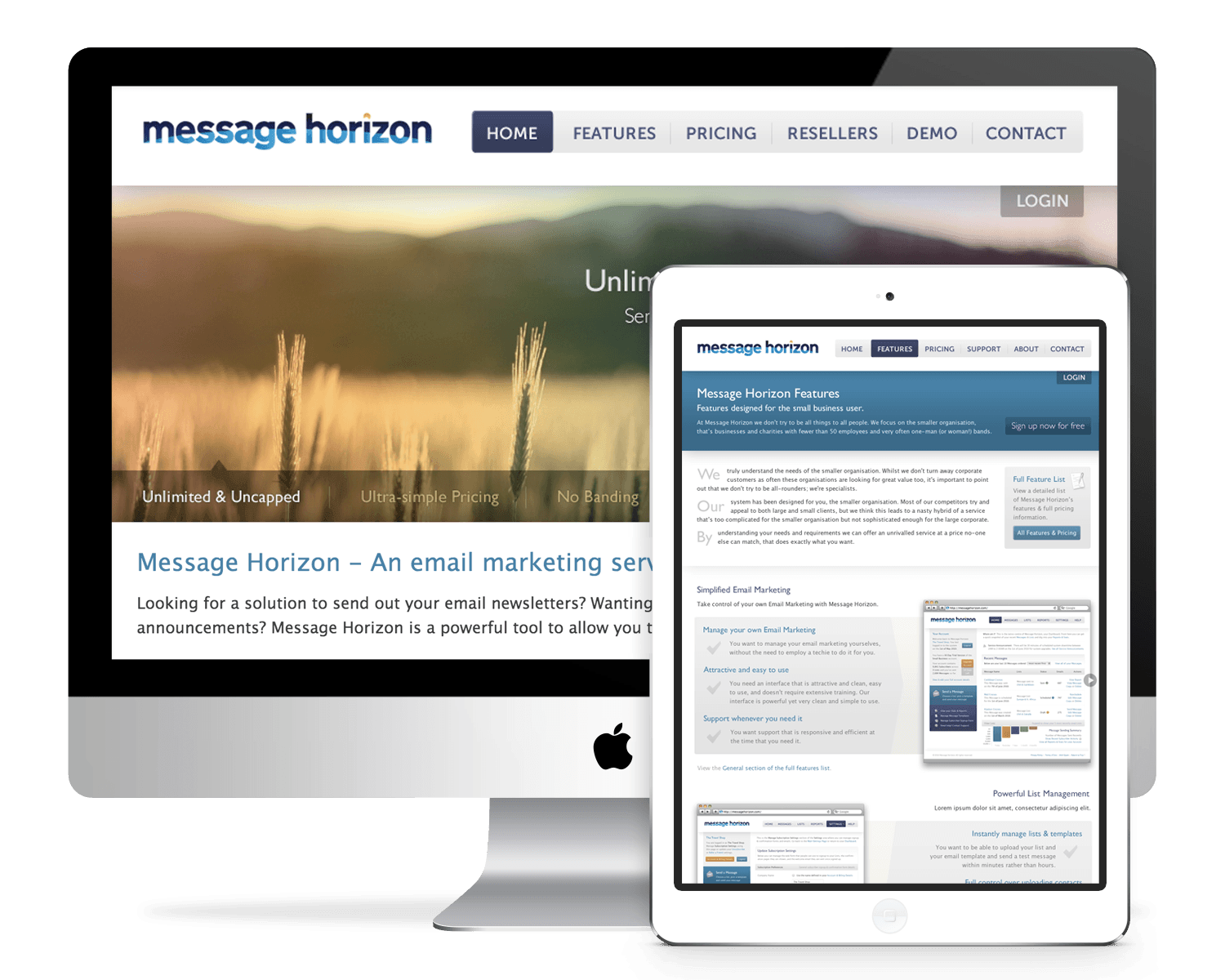
To market the email marketing web application, I designed a clean, straightforward static site that uses a light, bright colour palette and type-driven layouts to introduce the key features and differentiators of the product. Photographic imagery is used on the homepage to introduce the key features of the product and was selected to key-in with the brand name’s “sunrise/sunset” connotations.
The development was completed in-house and, as with the administration dashboard web application, was designed and built before responsive web design was at the forefront of web users’ minds.

The Message Horizon logomark, set in bold, lowercase serif type nods to the “horizon” in the product name, incorporating a planetary, sunrise motif in the two-colour fill of the characters and a playful, crescent-accented “i”.

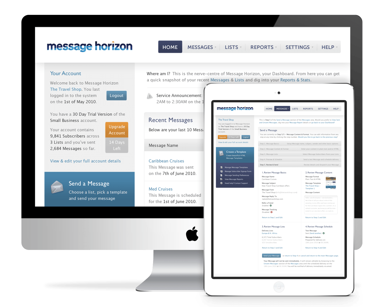
The web interface of Message Horizon’s core product—a web-administered email marketing tool—is defined by a simple, text-driven interface, dictated by the functionality and data-driven nature of the product. The design was realised in-house by Message Horizon’s developers and, as with the marketing site, was designed and built before the widespread adoption of responsive web design techniques.